使用 Kernel SHAP(SHapley 加性解释)来解释表格数据分类模型。 内核 SHAP 是一种与模型无关的方法,用于估计每个特征对模型预测的贡献。 在成人人口普查收入数据集上训练逻辑回归模型,然后使用 SynapseML TabularSHAP 转换器计算特征级说明。
先决条件
获取 Microsoft Fabric 订阅。 或者,注册免费的 Microsoft Fabric 试用版。
登录到 Microsoft Fabric。
使用主页左下侧的体验切换器切换到Fabric。
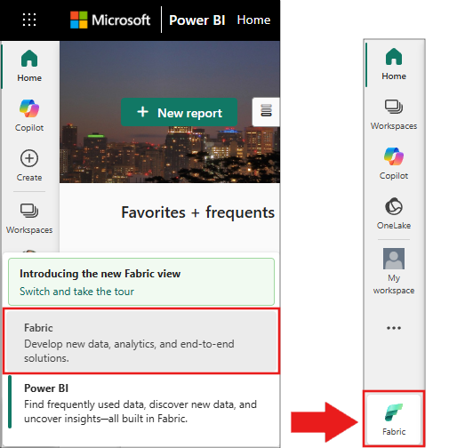
- 在工作区中创建一个新笔记本,并将其附加到湖仓。 有关详细信息,请参阅 “创建笔记本”。
SynapseML、PySpark、pandas 和 plotly 预安装在Fabric笔记本环境中。 无需安装额外的包。
导入包并定义辅助 UDF
在Fabric笔记本中,将以下代码粘贴到单元格中并运行它。 此步骤导入所需的库,并定义两个用户定义的函数(UDF),以便稍后提取矢量元素。
import pyspark
from synapse.ml.explainers import TabularSHAP
from pyspark.ml import Pipeline
from pyspark.ml.classification import LogisticRegression
from pyspark.ml.feature import StringIndexer, OneHotEncoder, VectorAssembler
from pyspark.sql.types import FloatType, ArrayType
from pyspark.sql.functions import col, lit, rand, broadcast, udf
import pandas as pd

vec_access = udf(lambda v, i: float(v[i]), FloatType())
vec2array = udf(lambda vec: vec.toArray().tolist(), ArrayType(FloatType()))
验证:在新单元格中运行以下代码。 应会看到输出 TabularSHAP imported successfully。
print("TabularSHAP imported successfully")
print(f"PySpark version: {pyspark.__version__}")
加载数据并训练分类模型
从Azure Blob 存储加载成人人口普查收入数据集,为目标标签编制索引,并训练逻辑回归管道。
df = spark.read.parquet(
    "wasbs://publicwasb@mmlspark.blob.core.windows.net/AdultCensusIncome.parquet"
)

labelIndexer = StringIndexer(
    inputCol="income", outputCol="label", stringOrderType="alphabetAsc"
).fit(df)
print("Label index assignment: " + str(set(zip(labelIndexer.labels, [0, 1]))))

training = labelIndexer.transform(df).cache()

categorical_features = [
    "workclass",
    "education",
    "marital-status",
    "occupation",
    "relationship",
    "race",
    "sex",
    "native-country",
]
categorical_features_idx = [feat + "_idx" for feat in categorical_features]
categorical_features_enc = [feat + "_enc" for feat in categorical_features]
numeric_features = [
    "age",
    "education-num",
    "capital-gain",
    "capital-loss",
    "hours-per-week",
]

strIndexer = StringIndexer(
    inputCols=categorical_features, outputCols=categorical_features_idx
)
onehotEnc = OneHotEncoder(
    inputCols=categorical_features_idx, outputCols=categorical_features_enc
)
vectAssem = VectorAssembler(
    inputCols=categorical_features_enc + numeric_features, outputCol="features"
)
lr = LogisticRegression(featuresCol="features", labelCol="label", weightCol="fnlwgt")
pipeline = Pipeline(stages=[strIndexer, onehotEnc, vectAssem, lr])
model = pipeline.fit(training)
验证:运行以下单元格。 您应该会看到训练数据的行数统计以及管道各阶段的确认信息。
print(f"Training rows: {training.count()}")
print(f"Pipeline stages: {[type(s).__name__ for s in model.stages]}")
assert training.count() > 30000, "Dataset should contain over 30,000 rows"
print("Model trained successfully")

# Expected output:
#Training rows: 32561
#Pipeline stages: ['StringIndexerModel', 'OneHotEncoderModel', #'VectorAssembler', 'LogisticRegressionModel']
#Model trained successfully
选择要解释的观测结果
从已评分的训练数据中随机选择五条观测记录。 这些观测数据就是你为其生成 SHAP 解释的实例。
explain_instances = (
    model.transform(training).orderBy(rand()).limit(5).repartition(200).cache()
)
display(explain_instances)
验证:确认样本大小。
count = explain_instances.count()
print(f"Explain instances: {count}")
assert count == 5, f"Expected 5 rows, got {count}"
print("Sample selected successfully")
配置并运行 TabularSHAP
创建TabularSHAP解释器并将其应用于所选观测结果。 关键参数包括:
| 参数 | 说明 |
|---|---|
inputCols |
模型用于预测的特征列。 |
outputCol |
包含 SHAP 输出值的列的名称。 |
numSamples |
用于 Kernel SHAP 估计的扰动样本数。 较高的值更准确,但速度较慢。 |
model |
需要解释的训练后的管道模型。 |
targetCol |
待解释的模型输出列。 在此示例中,该列是 probability。 |
targetClasses |
要解释的类索引。
[1] 仅解释 1 类概率。 使用 [0, 1] 来解释这两个类。 |
backgroundData |
用作集成特征的参考分布的训练数据示例。 |
shap = TabularSHAP(
    inputCols=categorical_features + numeric_features,
    outputCol="shapValues",
    numSamples=5000,
    model=model,
    targetCol="probability",
    targetClasses=[1],
    backgroundData=broadcast(training.orderBy(rand()).limit(100).cache()),
)

shap_df = shap.transform(explain_instances)
注释
此步骤可能需要几分钟时间,具体取决于 numSamples 群集大小。 在默认的 Fabric Spark 群集上,使用 numSamples=5000 和 5 个观测值时,预计需要 3 到 10 分钟。
验证:检查 SHAP 输出列是否存在。
assert "shapValues" in shap_df.columns, "shapValues column missing"
print(f"SHAP output columns: {shap_df.columns}")
print("TabularSHAP transform completed")
提取 SHAP 值
从结果 DataFrame 中提取类 1 概率和 SHAP 值。 对于每个观测,SHAP 值向量以基准值(背景数据集的平均输出)开头,随后是每个特征对应的一个值。
shaps = (
    shap_df.withColumn("probability", vec_access(col("probability"), lit(1)))
    .withColumn("shapValues", vec2array(col("shapValues").getItem(0)))
    .select(
        ["shapValues", "probability", "label"] + categorical_features + numeric_features
    )
)

shaps_local = shaps.toPandas()
shaps_local.sort_values("probability", ascending=False, inplace=True, ignore_index=True)
pd.set_option("display.max_colwidth", None)
display(shaps_local)
验证:确认 pandas DataFrame 的结构。
expected_cols = len(categorical_features) + len(numeric_features) + 3
print(f"DataFrame shape: {shaps_local.shape}")
print(f"Expected columns: {expected_cols}, Actual: {shaps_local.shape[1]}")
assert shaps_local.shape == (5, expected_cols), f"Unexpected shape: {shaps_local.shape}"
print("SHAP values extracted successfully")
可视化 SHAP 值
为每个观察创建一个条形图,其中显示了每个特征对预测概率的贡献。
from plotly.subplots import make_subplots
import plotly.graph_objects as go

features = categorical_features + numeric_features
features_with_base = ["Base"] + features

rows = shaps_local.shape[0]

fig = make_subplots(
    rows=rows,
    cols=1,
    subplot_titles="Probability: "
    + shaps_local["probability"].apply("{:.2%}".format)
    + "; Label: "
    + shaps_local["label"].astype(str),
)

for index, row in shaps_local.iterrows():
    feature_values = [0] + [row[feature] for feature in features]
    shap_values = row["shapValues"]
    list_of_tuples = list(zip(features_with_base, feature_values, shap_values))
    shap_pdf = pd.DataFrame(list_of_tuples, columns=["name", "value", "shap"])
    fig.add_trace(
        go.Bar(
            x=shap_pdf["name"],
            y=shap_pdf["shap"],
            hovertext="value: " + shap_pdf["value"].astype(str),
        ),
        row=index + 1,
        col=1,
    )

fig.update_yaxes(range=[-1, 1], fixedrange=True, zerolinecolor="black")
fig.update_xaxes(type="category", tickangle=45, fixedrange=True)
fig.update_layout(height=400 * rows, title_text="SHAP explanations")
fig.show()
验证:确认已创建绘图对象。
print(f"Figure traces: {len(fig.data)}")
print(f"Figure height: {fig.layout.height}px")
assert len(fig.data) == 5, f"Expected 5 traces, got {len(fig.data)}"
print("Visualization created successfully")
解读结果
每个子图表示一个观测值。 条形图显示:
- 基准:背景数据集上的平均模型输出(基线概率)。
- 正的 SHAP 值:将预测结果推向类别 1 的特征(收入大于 50K)。
- 负 SHAP 值:将预测推送到类 0 的功能(收入小于或等于 50K)。
基值和所有特征 SHAP 值的总和等于该观察模型的预测概率。
故障排除
| 问题 | 原因 | 解决方案 |
|---|---|---|
OutOfMemoryError 在 TabularSHAP 期间 |
numSamples 对可用内存而言太大。 |
减少 numSamples(例如,减少到 1,000),或增加 Spark 执行器内存。 |
| SHAP 转换速度缓慢 | 较高的 numSamples 且具有许多特性时,会增加计算时间。 |
减少 numSamples 到 1,000-2,000,以便更快地探索结果。 增加最终分析的内容。 |
FileNotFoundException 用于 Parquet |
网络访问 mmlspark.blob.core.windows.net 被阻止。 |
确认 Fabric 工作区是否具有出站互联网访问权限。 或者,将数据集上传到 Lakehouse 中。 |
shapValues 列包含空值 |
如果特征值不在训练分布之外,某些观察可能会失败。 | 检查输入特征中是否存在 null 值或异常值。 从结果中过滤掉 null 值。 |
display() 不显示输出 |
代码在Fabric笔记本环境外运行。 | 在标准Python环境中使用 shaps_local.head() 或 print(shaps_local)。 |
清理
如果为本教程将数据集上传到 Lakehouse,请将其删除以释放存储:
# Remove cached DataFrames from memory
training.unpersist()
explain_instances.unpersist()
print("Cached DataFrames released")