Note
Access to this page requires authorization. You can try signing in or changing directories.
Access to this page requires authorization. You can try changing directories.
APPLIES TO: ![]() Power BI Desktop
Power BI Desktop ![]() Power BI service
Power BI service
Power BI supports the use of inline hierarchy labels to enhance hierarchical drilling. By using inline hierarchy labels, you can see all levels of a hierarchy displayed together as you drill down into your data.
How inline hierarchy labels work
When you use inline hierarchy labels, you see hierarchy labels as you expand visuals by using the Expand All feature. By seeing these hierarchy labels, you can also choose to sort by these different hierarchy labels as you expand your hierarchical data.
Use the built-in Expand feature (without sorting by hierarchy labels)
Before you see inline hierarchy labels in action, review the default Expand to next level feature behavior. This review helps you understand and appreciate how useful inline hierarchy labels can be.
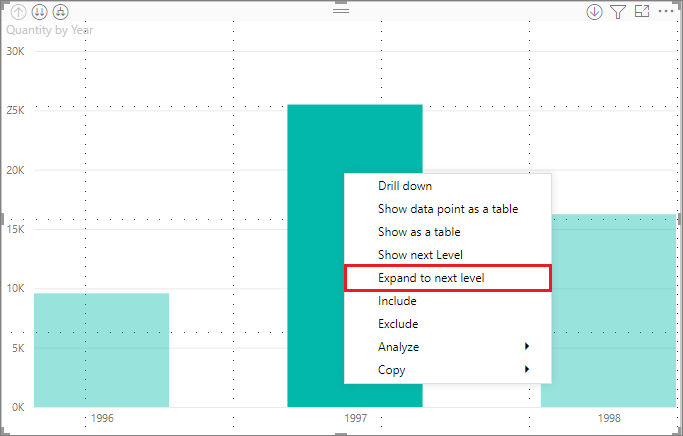
The following image shows a bar chart visual for annual sales. When you right-click on a bar, you can choose Expand to next level.
Note
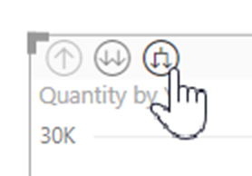
Instead of right-clicking on a bar, you can select the Expand button on the top left of the visualization.
When you select Expand to next level, the visual expands the date hierarchy from Year to Quarter, as shown in the following image.

The Year and Quarter labels appear inline together. This labeling scheme continues as you Expand All down to the bottom of the hierarchy.

This behavior is how the built-in Date hierarchy works. The Date hierarchy associates with fields that have a date/time data type. The next section explains how the inline hierarchy labels feature is different.
Use inline hierarchy labels
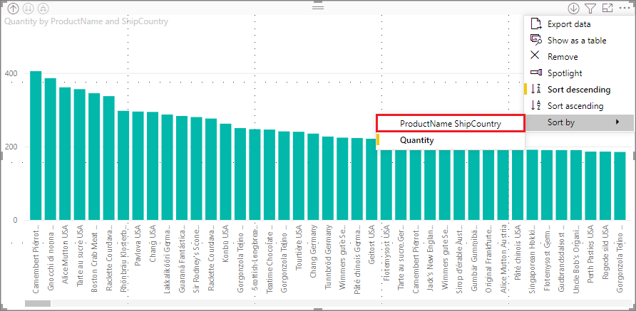
Now let's look at a different chart by using data that has informal hierarchies. In the following visual, you have a bar chart with Quantity, using ProductName as the axis. In this data, ProductName and ShipCountry form an informal hierarchy. From here, you can again select Expand to next level to drill down into the hierarchy.

Selecting Expand to next level shows the next level with the inline display of hierarchy labels. By default, inline hierarchies are sorted by the measure value—in this case, Quantity. With inline hierarchy labels enabled, you can choose to sort this data by the hierarchy too. Select More options (...) in the upper right corner, and then select Sort by ProductName ShipCountry as shown in the following image:
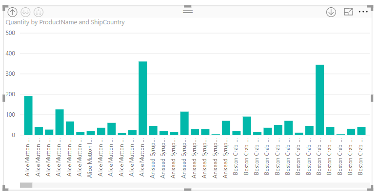
After you select ShipCountry, the data is sorted based on the informal hierarchy selection, as shown in the following image.
Note
The inline hierarchy label feature doesn't yet support sorting the built-in time hierarchy by value. It's only sorted by hierarchy order.
Troubleshooting
If your visuals get stuck in an expanded inline hierarchy level state where drilling up doesn't work, try deleting the visual and recreating it.